


How to Impress your Customers with Custom Boxes using the 2018 Color of the Year
Pantone, (the self-proclaimed color authorities) has been crowning a “Color of the Year” since 2000. This award, which began as a discussion between a few individuals has transformed into the Pantone Color Institute – a group that starts global research early in the spring, looking for recurring color signals in daily life: fashion, housewares, cosmetics, and packaging.

Pantone states that the Color of the Year is actually “a color snapshot of what we see taking place in our global culture that serves as an expression of a mood and an attitude.”
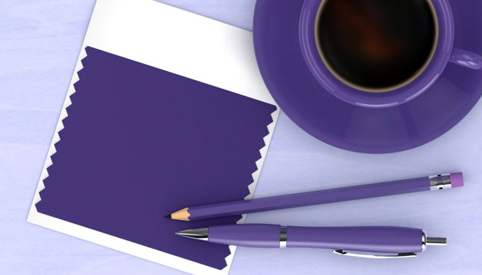
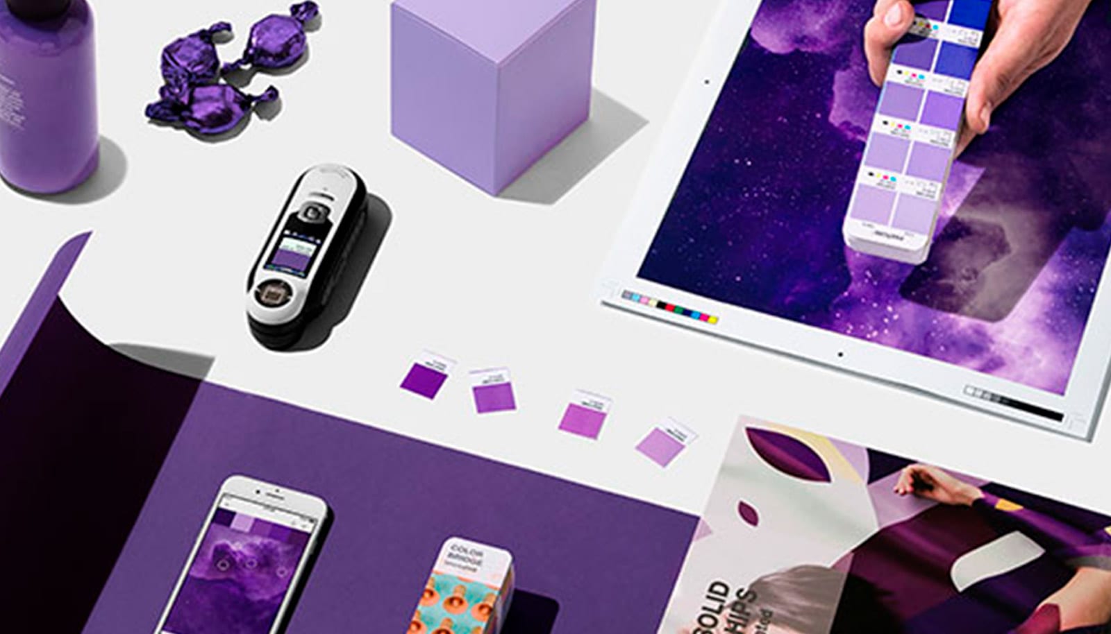
For the year 2018, they named PANTONE-18-3838 Ultra Violet as the winner. This is no shrinking violet: it’s a stunning and vivid blue-based purple that isn’t for the shy. Inspired by possibilities and unconventional symbols, this color is meant to reflect what is lacking in our world today.
This means you’re about the see a whole lot more purple popping up everywhere. This color is set to take over many aspects of design- everything from interiors to packaging. “It communicates originality, ingenuity and visionary thinking”, Letrice Eiseman executive director of the Pantone Color Institute explains. You find it in the cosmos (stunning deep-space nebula anyone?), while pop culture icons like Prince and David Bowie have used the color to express individuality.
What Does This Mean for Custom Packaging?
Color psychology tells us that certain colors can make people feel different ways. Red suggests energy and strength, blue is linked to calm and clarity, while green symbolizes renewal and growth. Consider your customer’s perception of your brand and its mission statement. Your color choices should relate to the product you’re selling and support the individuality you want to portray as a brand.
You don’t have to align your marketing material with cliché color associations. In fact, if you mix the Ultra Violet color of the year with your current branding, it will undoubtedly bring a lot of awareness to your customer’s eyes. This color is full of intrigue and symbolizes what lies ahead in the future. The color stands for futurism and expresses that your company is forward thinking.
How to Use Ultra Violet in Your Box Design
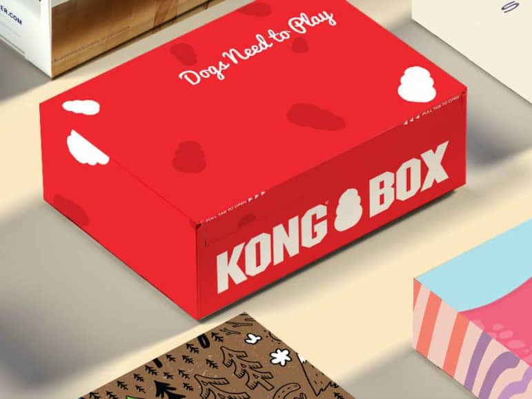
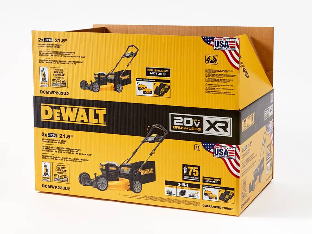
Using Ultra Violet for marketing can be very alluring to your customers. You can decide to use it as an accent or go bold and use it all over your box design. This color choice will amplify your brand’s marketing efforts.Whether you’re using shippers, mailers, a point of purchase display, or trash boxes, your brand is more than what is inside the box. It can become a known brand just by its custom-designed box.
The best colors to use with Ultra Violet:
● Lime Green
● White
● Gold
● Yellow
● Black
● Pink
● Lilac
● Periwinkle
● Light Grey
● Orange
There are yearly studies devoted to discovering how colors make people feel and ways to use them in branding. Read more this psychology in this article by Jen Reviews.
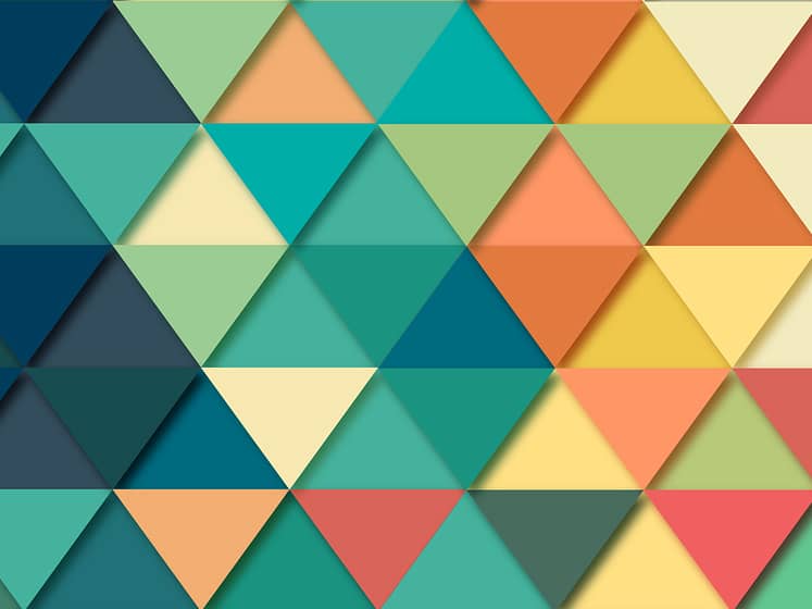
For now, bright colors are in. They can certainly make a design pop, and our opinion, it’s one of the strongest graphic design trends for 2018. Try incorporating Ultra Violet along with one of the complimentary colors above into a new pattern or graphic. Be bold and mix it up!
Learn How to Make Your Brand Unforgettable with CompanyBox
Custom printed boxes are an affordable way for you to advertise your brand. Let CompanyBox help you find new ways to make your brand stand out by mixing in exciting colors like the “Pantone Color of The Year 18-3838 Ultra Violet.” So, if you’re ready to elevate your brand to the next level, let’s get started!
“As individuals around the world become more fascinated with color and realize its ability to convey deep messages and meanings, designers and brands should feel empowered to use color to inspire and influence. The Color of the Year is one moment in time that provides strategic direction for the world of trend and design.” – Laurie Pressman, Vice President of the Pantone Color Institute.
Images Via: Pantone
How can we help?
We’re all ears. Drop us a line and we’ll get in touch!


See It to Believe It.
Get started with a sample CompanyBox mailer.