
5 Packaging Design Trends You Need To Know About
When you think of the way people dressed in the 60’s, does an image come to mind? How about the 80’s? It’s easy to picture fashion trends from past and present, but can you do the same with packaging trends?
Just as in fashion, packaging trends come and go. It’s a cycle we are all familiar with, but many may not think to look around at the grocery store or mall for what’s trending in packaging. It’s important these designs stay fresh and relatable to draw a consumer’s eye. And if you are a business owner who relies on packaging for your product, it’s helpful to know what is currently working and why.
Packaging is no longer simply about packaging the object—with social media everywhere, it is also about the unboxing experience and art directing. Many designers start their process knowing they are not just creating a box or bag, they are creating a worthy image.
So here we are. Let’s talk trends. Keep reading for 5 current packaging design trends you can count on.
1. Add a Pattern
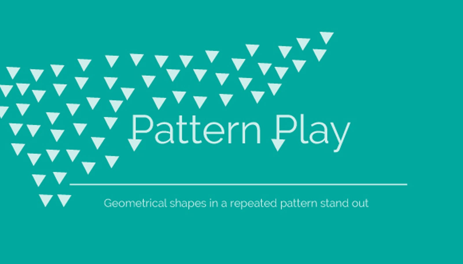
In a world where over-the-top design is commonplace, designers are using familiar shapes, colors and patterns. The idea of repetitive shapes might seem simple, but the technique can be powerful and compelling when used correctly.
Repeating a visual illustration that captures the meaning of a brand sends a strong message. Whether your brand is bold and dynamic or whimsical and spirited, patterning your package can create a strong identity the customer is sure to remember.
2. Keep It Simple

Look around you and you’ll see more and more packaging with large text, simple spelling and a straightforward message. Designers now know that packages are billboard-like advertisements. Thus, the benefit of a simple, clear message in large bold letters gets repeated with every new viewer.
And in an oh, so crowded world, simplicity can appeal to the overwhelmed customer buried under a mountain of choice. Please know, simple does not have to come across as lazy or incomplete. Quite the opposite, it can be seen as honest, refreshing and trustworthy.
3. Use Hand Lettering
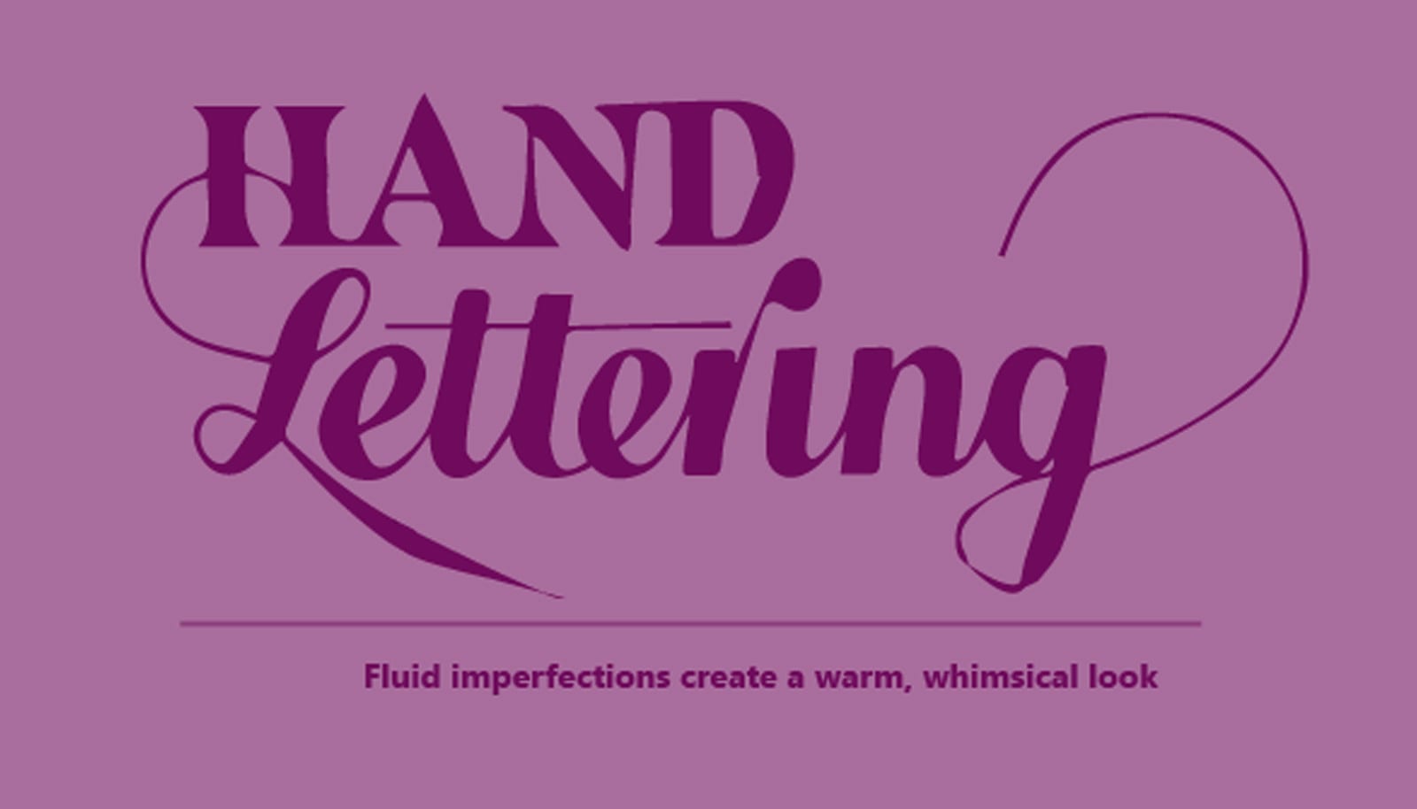
Now is the time to rebel against the sleek, cold environment where many packages live. Hand lettering is no longer hiding; no longer apologizing for not being perfect. This trend proudly embraces those imperfections.
Hand lettering is an old idea, resurrected to fit present-day applications. It’s really a beautiful connection between design and words. A way to make the words on your package a whimsical piece of art and evoke emotions. The reason so many designers are attracted to hand lettering is easy to see.
4. Incorporate Bright Colors

It’s no secret color can affect moods, feelings and emotions. Artists and interior designers have had a longtime understanding of this powerful communication tool.
Now, we are starting to see that packaging is following suit. When it comes to the communication function of packaging, color is one of the most significant elements for attracting customers. And lately we’ve noticed designers put color to work in new and exciting ways. Bright colors are beginning to make a scene.
Interested in finding out which color is best for your branded package? We searched around for the types of feelings colors can evoke. Experts says the colors you choose can send a subliminal message to inspire any potential customer to buy your product. If you’re torn between the best color for your packaging, consider combining a few!
- Blue: confidence, success and reliability
- Green: environmental friendliness, toughness, durability, masculinity and sustainability
- Purple: femininity, glamor and charm
- Pink: youth, imagination and fashion
- Yellow: fun, modern, original and innovative
- Red: expertise and self-assurance
- Orange: adventure, fun, affordability and uninhibited
- Turquoise: calming, inspiring and clean
- Black: power, mystery, elegance
- White: cleanliness, purity, and simplicity
- Brown: wholesome, organic, safety, and comfort
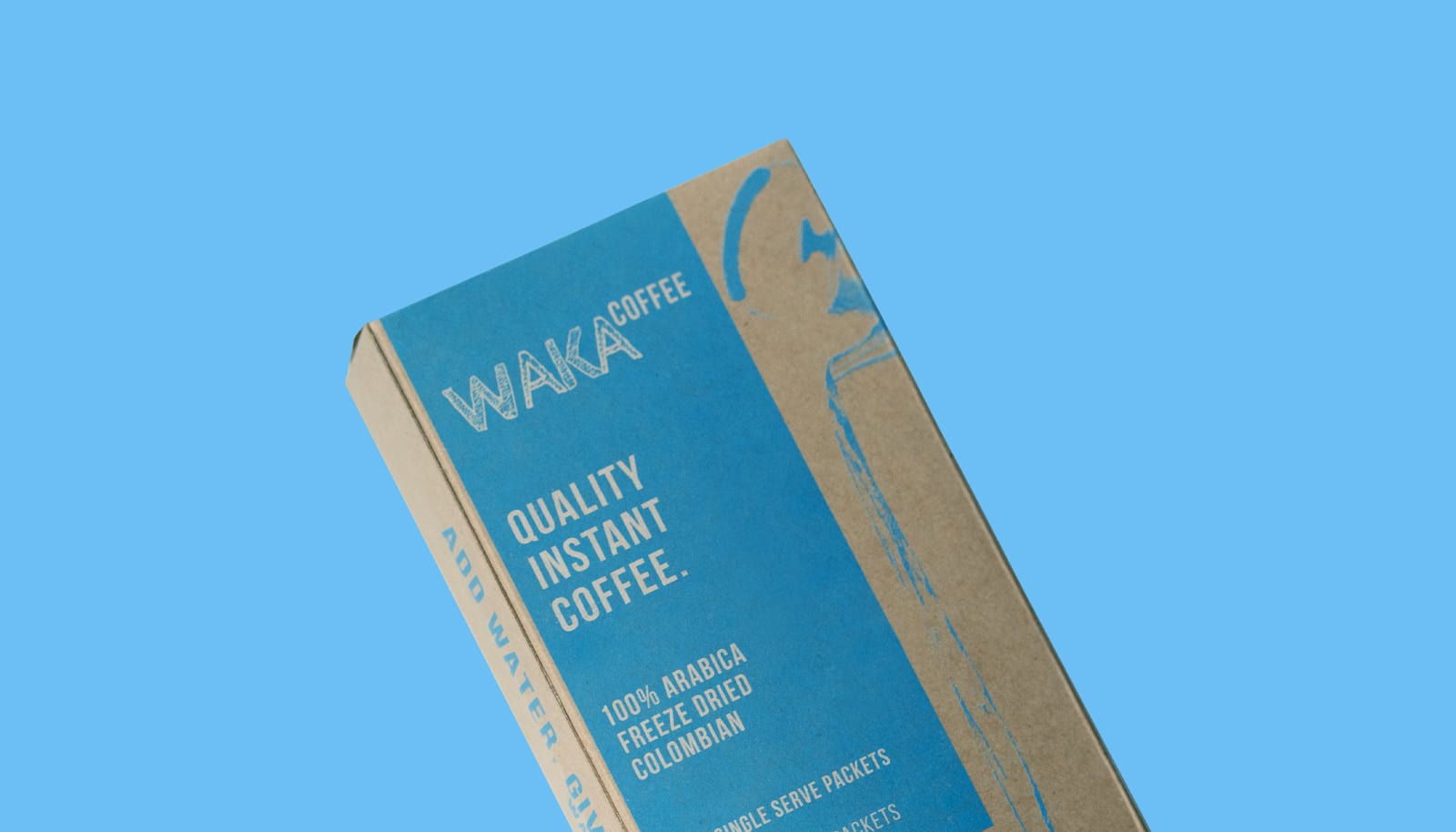
5. Create a Fusion of Old & New

This trend is built to be reminiscent of simpler times when designs were detail-oriented and hand made. It brings back memories of techniques like calligraphy, letterpress and foiling.
The key to a vintage design is to find a balance. How to evoke nostalgia while maintaining a sharp and modern look at the same time? Try printing on Kraft boxes using ornate lettering in a minimal retro color palette.
So here’s to trying new packaging designs. Variety is the spice of life, right? Maybe it’s time to shake things up a little and add a new design to your box!
How can we help?
We’re all ears. Drop us a line and we’ll get in touch!


See It to Believe It.
Get started with a sample CompanyBox mailer.