Packaging Design Predictions for 2019
With every new year, comes fresh designs, trends and different techniques. If you are in a position to stretch those design muscles, it’s important to keep up on new trends-even if you are just using them as a source of inspiration.
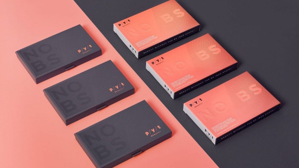
1. Minimalism
We’ve all heard the phrase ‘less is more’, but keeping it simple isn’t always easy. Design with a minimal aesthetic takes lots of critical thinking and tweaking, but when done right, it can give a serious “wow” factor.

We see 2019 leaning toward a modern, minimalistic style with a more careful use of white space. White space (or negative space) doesn’t have to be just white. It can be any area within the design that is free from text, images or embellishments. As a note, the best minimalist designs often have a single feature that stands out above all else. In 2019, you can say more with less.
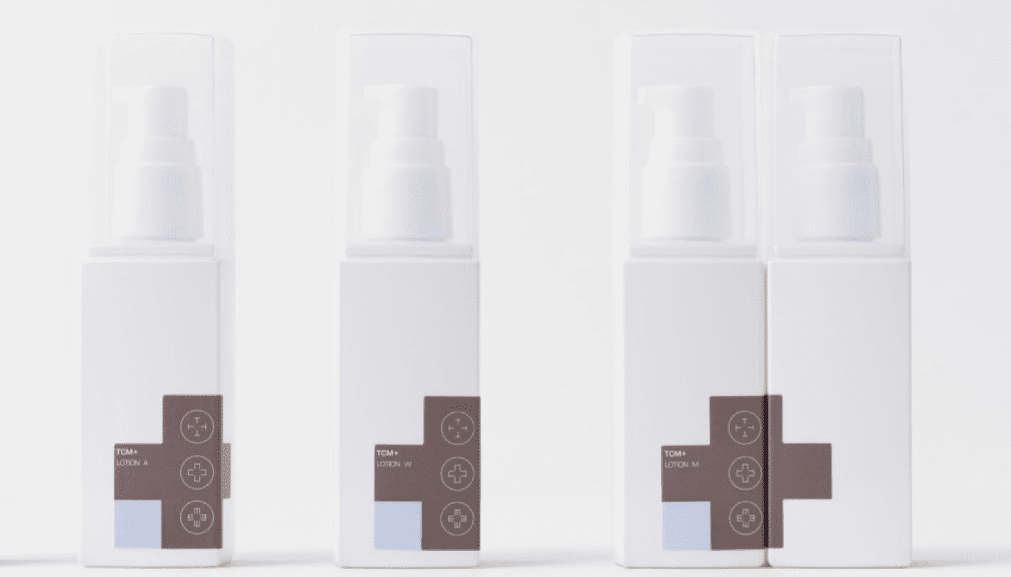
2. Pantone Color of the Year: Living Coral
Packaging designers take note. Each year Pantone announces it’s Color of the Year and for 2019 they opted for a color that is anything but drab. Living Coral, predicted to dominate the design industry over the next 12 months is said to be a “nurturing color that appears in our natural surroundings and at the same time, displays a lively presence within social media”. That doesn’t mean you should change your entire logo to Living Coral, but think about using it as an accent on your marketing materials or next month’s subscription box so your audience knows you’re on trend.
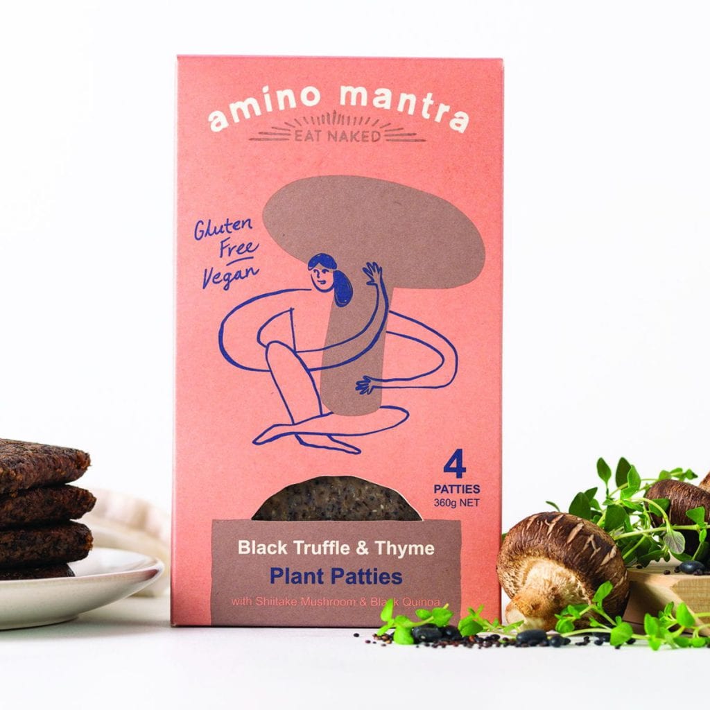
3. Hand Drawn Graphics
After years of thick, bold lines we are starting to see more and more delicate, elegant illustrations. This handmade aesthetic is a nod toward a more sophisticated, minimal style. Some designers are adding hand-drawn graphics over other images, taking those stock photos and giving them some originality. It could include words or even just a fun doodle. Others use the hand drawings as the actual focal point of the box. We love this personal touch and think it’s a nice opposition to digitally made designs, if you’re looking to try something different.

4. Asymmetrical Layouts
A few years ago, we were seeing an influx of websites built with template-based programs like Canva and Squarespace. These sites provided beginners with beautiful products but with it, we saw rigid and grid-like templates become more commonplace. Fast forward to 2019 and designers are breaking free. Looking to create products that feel more alive, designers are adding aspects with movement and interest. The asymmetrical layout demands attention because it creates a feeling of curiosity as the consumer where the information and graphics might go next.
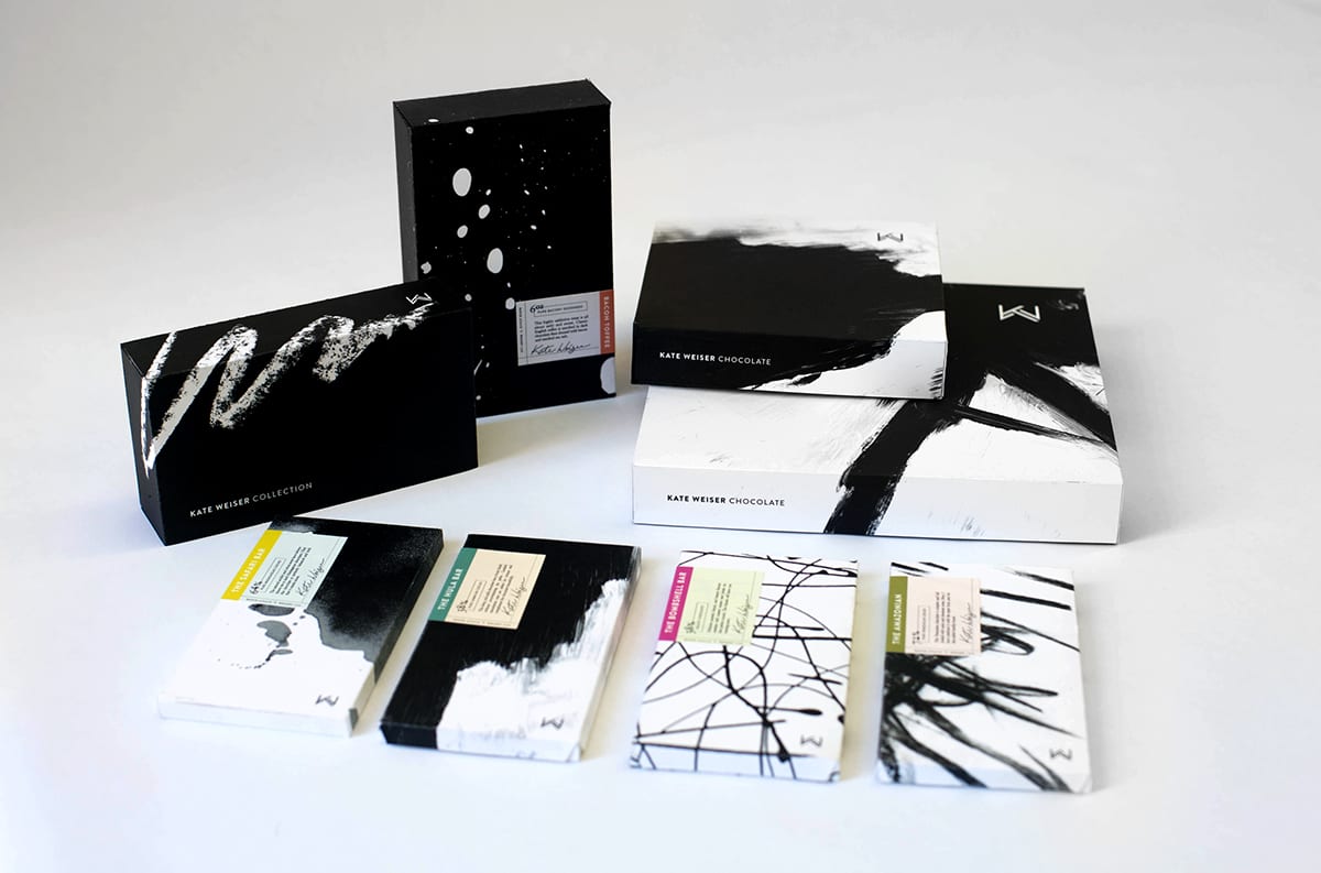
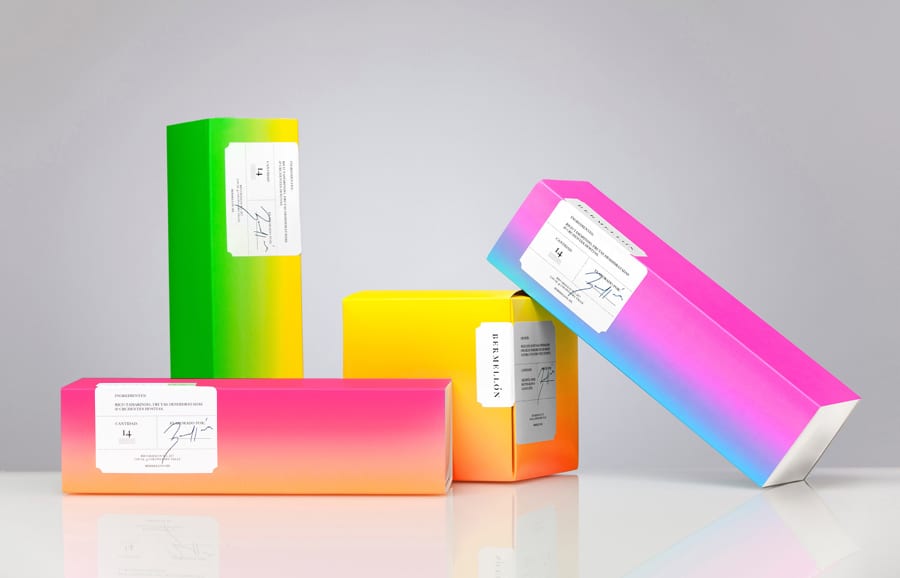
5. Bright Gradients
Gradients aren’t a new design concept. We see them everywhere, even in nature. You can see them in the sky as the sun rises and sets, which might be why the transition of color (when done correctly) can stimulate a sense of peace and calm- even excitement. Gradients keep fascinating both designers and consumers and have become a key trend within the design world.
For 2019, look for gradients to bring fresh depth and dimension to packaging. Instead of living in the background, expect to see it become a main component in the design.

6. Photography
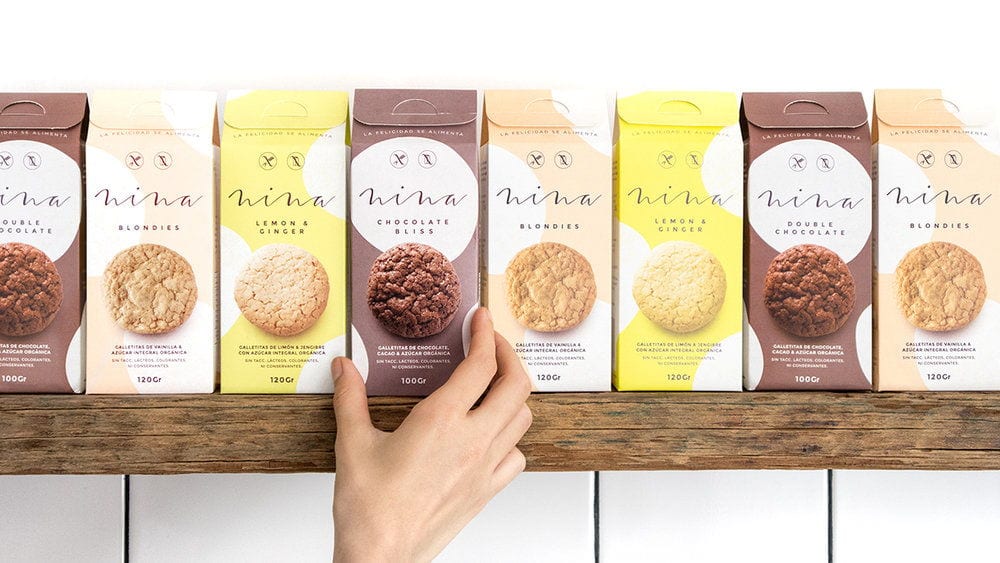
Graphics and typography are not the only weapons in your packaging arsenal. Photography has always been strongly linked to design and it’s a great way for getting your packaging designs noticed.
More than anything, photography tells an authentic story in a very short amount of time. It’s a way to make a human connection and give a complex visual message. Use the photo alongside your brand’s typography and/or other illustrated elements for a pulled together look.


What is your favorite packaging design prediction for 2019? We can’t wait to see what you come up with!
How can we help?
We’re all ears. Drop us a line and we’ll get in touch!
"*" indicates required fields
More Reads
4 Brilliant Kraft Packaging Designs
March 27, 2024
See It to Believe It.
Get started with a sample CompanyBox mailer.


